Introduction
Most writing about design systems focuses on concepts like tokens, components, variants, and patterns, and how those pieces should look, behave, and fit together.
A design system is meant to bring consistency and speed to product development. At the product level, this usually works well. Buttons look like other buttons, spacing follows a shared scale, and colors and typography stay consistent across features.
Developers interact with the design system through code every day. For them, the design system is also an API, and that API is often less consistent than the visual system it represents.
SwiftUI gives us several ways to shape a component API. Configuration can live in an initializer, a ViewModifier, a style protocol (e.g. ButtonStyle), an environment value, or some combination of them.
One component might put all of its configuration in the initializer:
DSButton(
    "Continue",
    image: Image(systemName: "arrow.right"),
    size: .small,
    variant: .outlined
) {
    submit()
}
Another might use ViewModifiers:
DSButton("Continue") {
    submit()
}
.dsImage(Image(systemName: "arrow.right"))
.dsSize(.small)
.dsVariant(.outlined)
Another might combine the approaches:
DSButton(
    "Continue",
    image: Image(systemName: "arrow.right")
) {
    submit()
}
.dsSize(.small)
.dsVariant(.outlined)
The problem
Predictability
These APIs are not predictable.
If I were to show you DSButton’s API surface, would you be able to tell how to add an Image to the Chip? How do you make the text in your Banner centered? Some components set their properties via the initializer, while others take it through a ViewModifier or perhaps an environment value.
Discoverability
And how do you handle discoverability in these approaches? How do you know what properties are supported and how to use them?
In such cases, what happens is that you find yourself peeking into the codebase to find existing usages of the component, or even look into the component implementation to figure out what it supports and how to use it properly.
A design system should reduce those questions, not introduce another set of conventions developers have to memorize.
Ideally, once you understand how one component is constructed and configured, you should have a good idea of how the next one works. The API should feel predictable enough that developers rarely need to inspect the implementation just to use a component correctly. The developer-facing API should be as consistent as the visual system itself.
Design the call site first
The goal is to design a SwiftUI design system API with a clear and predictable shape, so developers could build consistent interfaces quickly and understand how unfamiliar components should be configured based on the ones they already know.
This requires us to separate responsibilities between the initializer, component-specific configuration methods, generic ViewModifiers, styles, and environment values.
For a button, this is the call site I imagine:
DSButton(
    "Continue",
    image: Image(systemName: "arrow.right")
) {
    submit()
}
.dsSize(.small)
.dsVariant(.outlined)
The initializer describes the component’s content and behavior (the what):
- title
- optional image
- action
The configuration methods describe separate presentation dimensions supported by the design system (the how):
- size
- visual variant
Together, these two choices produce a small, predictable set of presentations:
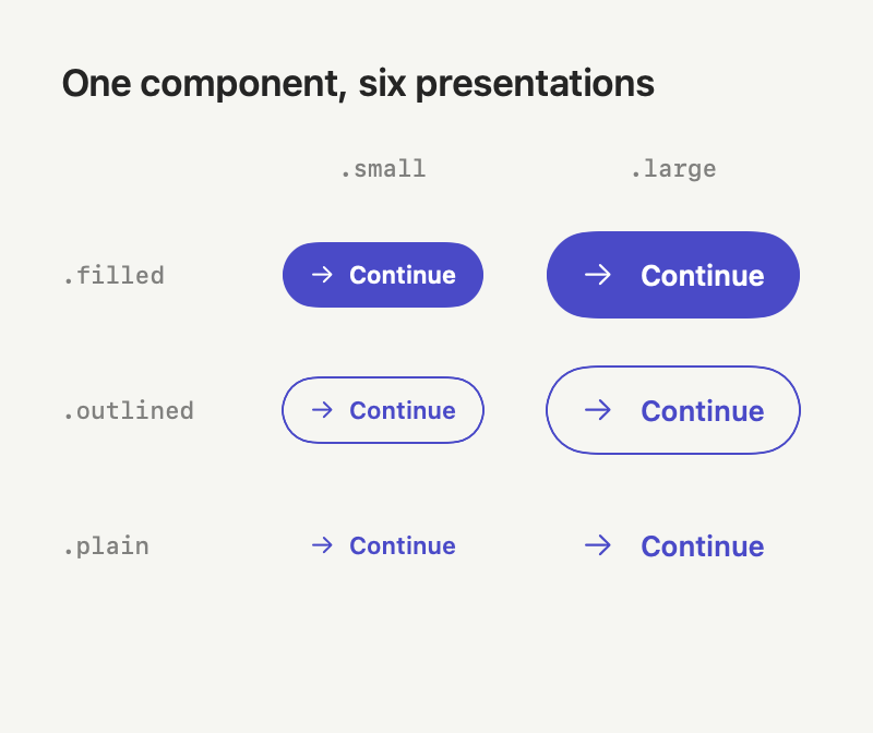
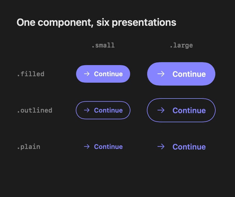
SwiftUI gives us several ways to implement this API. Before comparing them, let’s look at size. It affects the button’s internal layout, including the spacing between its image and title. Any approach we choose therefore needs a way to influence that private layout.
public struct DSButton: View {
    public enum Size {
        case small
        case large

        var contentSpacing: CGFloat {
            switch self {
            case .small:
                Spacing.small
            case .large:
                Spacing.medium
            }
        }
    }

    private var size: Size = .large

    // Title, image, action, and initializer omitted

    public var body: some View {
        Button(action: action) {
            HStack(spacing: size.contentSpacing) {
                if let image {
                    DSImage(image)
                }

                DSLabel(title)
            }
        }
    }
}
Evaluating the options
The ViewModifier
ViewModifier looks like the obvious choice. It gives us familiar dot syntax and is designed for reusable view transformations.
struct ButtonSizeModifier: ViewModifier {
    let size: DSButton.Size

    func body(content: Content) -> some View {
        content // There is no access to DSButton's internal HStack here
    }
}

extension View {
    func dsSize(_ size: DSButton.Size) -> some View {
        modifier(ButtonSizeModifier(size: size))
    }
}
The problem is that the ViewModifier only gets the button as opaque content. It can wrap the button as a whole, but it cannot reach into the private HStack where we actually need to change the spacing.
ViewModifier scope and discoverability
Another issue is scope. Custom modifiers are often exposed through extensions on View, which makes them available even on views where they have no meaningful effect.
As a design system grows, this can make autocomplete noisy and make it harder to distinguish component-specific configuration from modifiers intended for the rest of the system.
SwiftUI’s own modifiers have the same broad scope. For example, all of these calls compile:
Button("Continue")
    .textFieldStyle(.roundedBorder)

Text("Welcome")
    .buttonStyle(.borderedProminent)

Image(systemName: "bell")
    .toggleStyle(.switch)

Button("Submit") {}
    .pickerStyle(.segmented)
Why does a Button offer a textFieldStyle modifier even though it does not contain a TextField? The API surface for each component should be minimal and have only what is required.
Protocols can narrow this API surface to the components you own, but they do not change the underlying boundary: a ViewModifier has no direct access to the component’s private state or internal layout.
View styles
Styles separate a view’s configuration from its presentation. We can use a style protocol provided by SwiftUI or define one specifically for our design system.
ButtonStyle
Since the component is a button, ButtonStyle is another option. SwiftUI uses it to switch between built-in button presentations:
Button("Sign In") {}
    .buttonStyle(.bordered)
A custom style can also use state that SwiftUI owns, such as whether the button is pressed:
struct PressFeedbackStyle: ButtonStyle {
    func makeBody(configuration: Configuration) -> some View {
        configuration.label
            .opacity(configuration.isPressed ? 0.7 : 1)
            .scaleEffect(configuration.isPressed ? 0.98 : 1)
    }
}
This is exactly what ButtonStyle is good at. The limitation is that ButtonStyle.Configuration exposes the label as an opaque view, along with state known by SwiftUI such as isPressed and role. It does not expose the HStack that makes up that label, or the DSImage and DSLabel inside it, as independently configurable views, which is the access we need to change contentSpacing.
Custom styles
Another option is to define our own configuration and style protocol, similar to SwiftUI’s ButtonStyle:
public struct DSButtonStyleConfiguration {
    public let title: String
    public let image: Image?
}

public protocol DSButtonStyle {
    associatedtype Body: View

    @ViewBuilder
    func makeBody(
        configuration: DSButtonStyleConfiguration
    ) -> Body
}
A style can then build the button’s presentation from that configuration:
struct DefaultDSButtonStyle: DSButtonStyle {
    let size: DSButton.Size

    func makeBody(
        configuration: DSButtonStyleConfiguration
    ) -> some View {
        HStack(spacing: size.contentSpacing) {
            if let image = configuration.image {
                DSImage(image)
            }

            DSLabel(configuration.title)
        }
    }
}
Custom styles make more sense when we want to support very different versions of the same component. A style receives the component’s semantic configuration and builds its presentation, so it can change the entire view hierarchy rather than only values such as spacing or color. For example, a regular button, an icon-only button, and a floating action button could have completely different layouts while still representing the same kind of action.
That’s not really what we need here. size and variant are just a few supported ways to configure DSButton. We don’t want callers to replace how the button is built. We only want them to choose between the options the component already supports.
Environment values
The environment is another way to make configuration available inside a component. It works well when the value is meant to cascade through a hierarchy. SwiftUI uses it for things such as locale, layout direction, tint, control size, and styles.
VStack {
    Button("Save") {}
    Button("Delete", role: .destructive) {}
}
.buttonStyle(.borderedProminent)
We could use the same mechanism to make size available inside DSButton:
extension EnvironmentValues {
    @Entry var dsButtonSize: DSButton.Size = .large
}

public struct DSButton: View {
    @Environment(\.dsButtonSize) private var size

    // The body uses size for its internal layout
}
The downside of this approach is that local reasoning is lost when the environment value is set at a higher level.
VStack {
    DSButton("Continue") {
        submit()
    }

    DetailsView()
}
.environment(\.dsButtonSize, .large)
Every descendant that reads dsButtonSize now inherits .large, including buttons buried inside DetailsView. Sometimes that is exactly what we want, but looking at the button’s call site is no longer enough to understand its configuration. You may need to walk up the view hierarchy to find where the value came from.
However, things like Themes are a good fit for this model because they apply across many components. Instead of passing the current theme into every initializer, we can set it once at the boundary where it applies:
DetailsView()
    .environment(\.dsTheme, .primary)
Components inside that view can read the theme directly:
public struct DSButton: View {
    @Environment(\.dsTheme) private var theme

    // Read colors from the theme property
}
This is where the environment fits much better. A theme usually applies to an entire part of the UI, so passing it into every component individually would just be noise.
I reserve environment values for configuration that really is contextual or inherited:
- themes
- product or brand surfaces
- styles intentionally shared by all matching descendants
The approach I settled on
The simplest option turned out to be a copy-and-return method. The component stores its presentation properties. Each method creates a copy, changes one property, and returns the copy.
public struct DSButton: View {

    public enum Size {
        case small
        case large

        var contentSpacing: CGFloat {
            switch self {
            case .small:
                Spacing.small
            case .large:
                Spacing.medium
            }
        }
    }

    // For the sake of example, this has no effect in this implementation
    public enum Variant {
        case filled
        case outlined
        case plain
    }

    // MARK: - Content and behavior (the what)

    private let title: String
    private let image: Image?
    private let action: () -> Void

    // MARK: - Presentation configuration (the how)

    private var size: Size = .large
    private var variant: Variant = .filled

    public init(
        _ title: String,
        image: Image? = nil,
        action: @escaping () -> Void
    ) {
        self.title = title
        self.image = image
        self.action = action
    }

    public var body: some View {
        Button(action: action) {
            HStack(spacing: size.contentSpacing) {
                if let image {
                    DSImage(image)
                }

                DSLabel(title)
            }
        }
    }

    // MARK: - Private helpers
    // ...

    // MARK: - Copy-and-return methods

    public func dsSize(_ size: Size) -> Self {
        var copy = self
        copy.size = size
        return copy
    }

    public func dsVariant(_ variant: Variant) -> Self {
        var copy = self
        copy.variant = variant
        return copy
    }
}
The component’s body now uses its stored size while constructing the internal HStack. The call site still deals only with the supported size and variant presentation choices.
One consequence of defining these methods directly on DSButton is that they need to come before generic SwiftUI modifiers that change the resulting view type:
DSButton("Continue") {
    submit()
}
.dsSize(.small)
.frame(maxWidth: .infinity)
These methods return a modified copy instead of changing the original value. Swift does not allow a mutating method on the temporary value created by
DSButton(...), so returningSelfis what keeps the API chainable.
Predictability
This is where the predictability starts to pay off. If the same rule is used across components, you already have a good idea where to look: content and behavior go in the initializer, while presentation lives in component-specific methods.
So when you ask the same questions again:
…how to add an
Imageto theChip?
How do you make the text in your
Bannercentered?
You are probably thinking that you need to pass Image as an argument to the Chip initializer, or use something like a dsTextAlignment(.center) to center the text in the Banner.
Discoverability
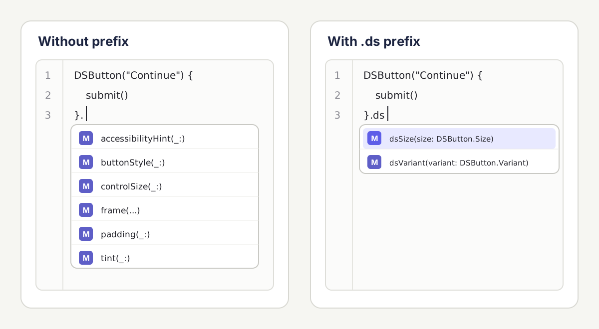
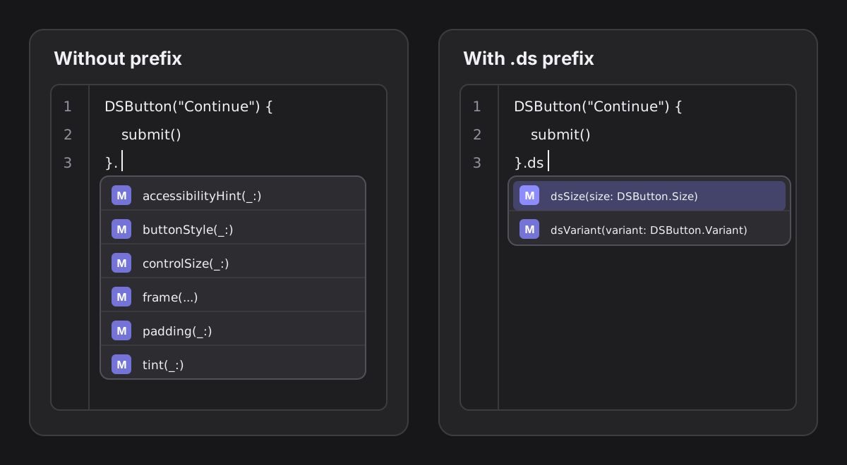
Prefixing design system methods with .ds also helps discoverability. Typing .ds narrows autocomplete to the options supported by the design system instead of mixing them with unrelated SwiftUI modifiers.
A practical rule of thumb
The pattern I now use for components is:
The initializer describes what the component is. Required content and behavior belong here:
DSButton(
    "Continue",
    image: Image(systemName: "arrow.right"),
    action: submit
)
Component-specific methods describe the how. These are presentation choices owned by the component:
.dsSize(.small)
.dsVariant(.outlined)
Generic SwiftUI modifiers stay generic.
.frame(maxWidth: .infinity)
.disabled(isSubmitting)
.accessibilityHint("Submits the current form")
Choosing the right approach
| Approach | Best Used When |
|---|---|
| Initializer | Required content and behavior that define what the component is |
| ViewModifier | General transformations that do not need direct access to component-owned state or internal layout (e.g. applying a shadow to the whole component) |
| (Button/Toggle…)Style | Reacting to state such as isPressed |
| Custom Style | Supporting substantially different implementations of the same component |
| Copy-and-return methods | Closed, component-specific presentation choices, especially when they affect private state or internal layout |
| Environment Values | Contextual values, such as themes, that should be inherited by descendants |
Conclusion
SwiftUI gives us several ways to solve this problem (see 1, 2). Each comes with a different tradeoff.
What matters most is knowing where each decision belongs. When those rules hold across the design system, each new component feels familiar. Learn one and you can usually predict how the next will work. The result is an API that is easy to discover, difficult to misuse, and consistent with what appears on screen.